Phintraco ga release data seperti biasa, kita cari dari beberapa sumber
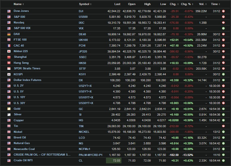
US closing 30 des merah, europe ijo, asia merah, US treasury bond yield merah, masih belum menentu mau kemana, tapi kalo technical sih bilang mantul, cocok sama arah US treasury bond
USD index up, gold up metal2 lain down, oil up, gas down, coal up, coal sama oil ini menarik
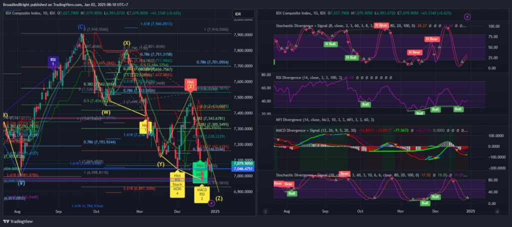
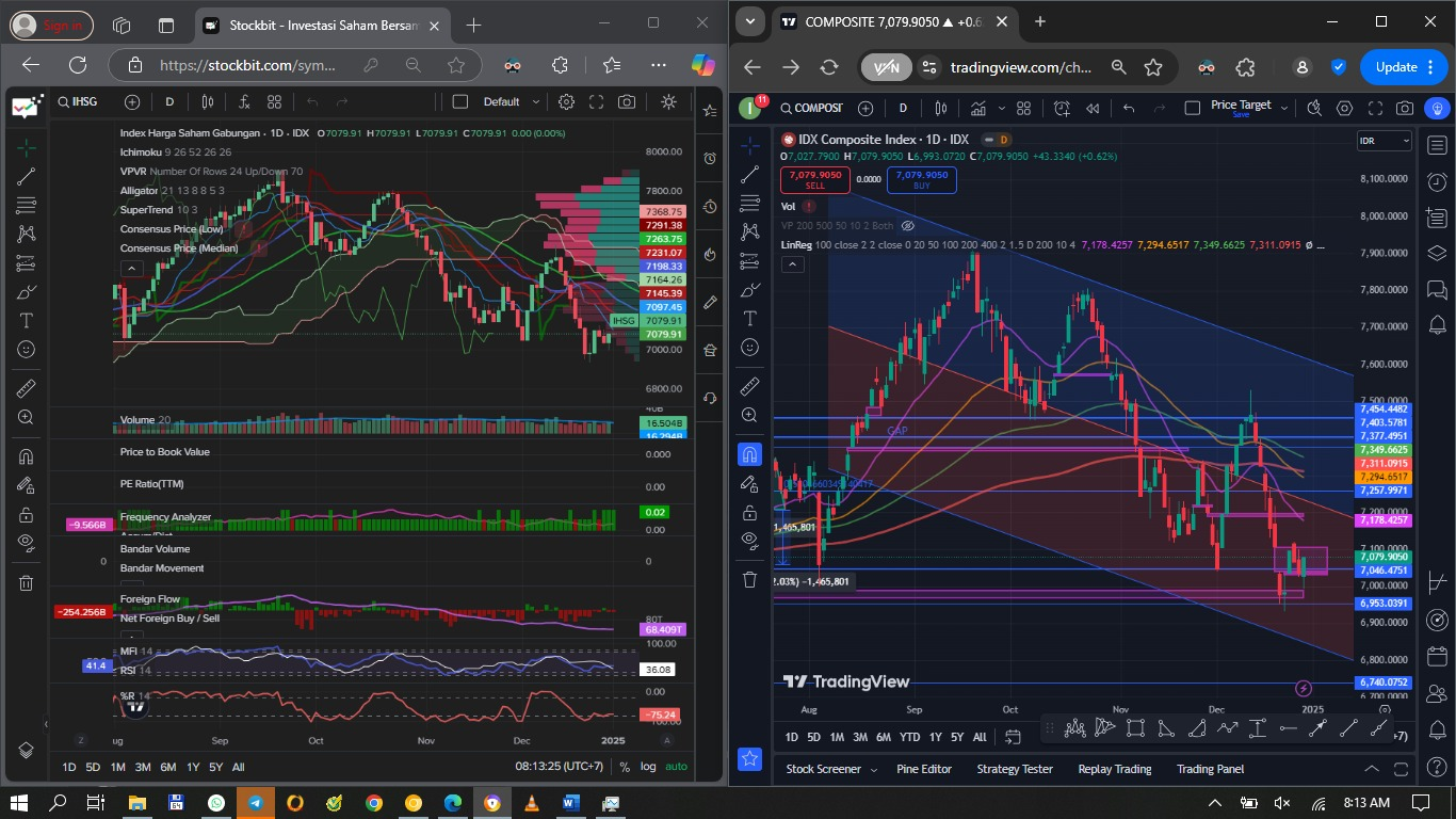
IHSG – stoch buy, macd rev up, MFI down, w% flat, elliot wave reverse done, lagi bikin higher low, reg bull div MACD RSI, confirmed by 2 bull candle, belum cancelled, sempet NFB tapi last day net sell lagi. Tanda2nya udah mau mantul sih
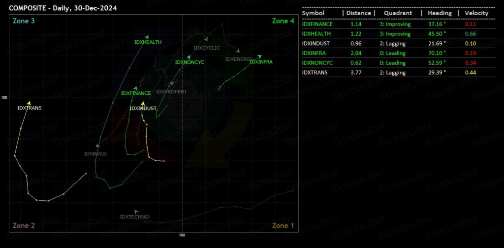
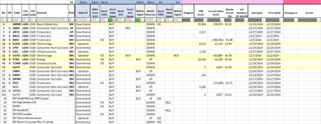
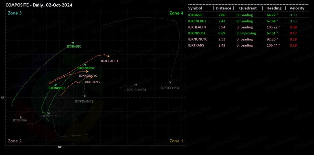
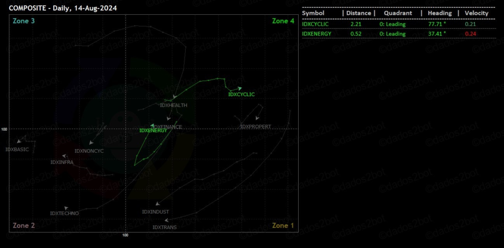
Terlihat mulai meriah, Infrastructure leading sama Consumer Non-Cyclicals, yang paling penting financials terlihat gerak
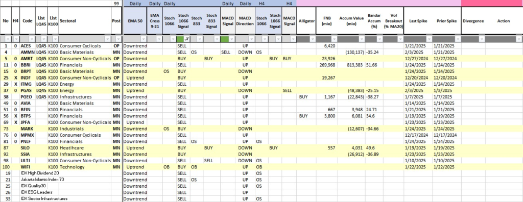
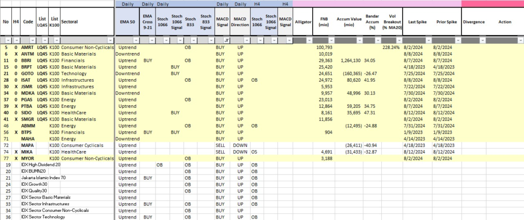
Stochastic Buy Signal Banyak, yang big accum AMMN, BUKA, GOTO, PTBA, AUTO, menarik dicermati BBCA BBNI
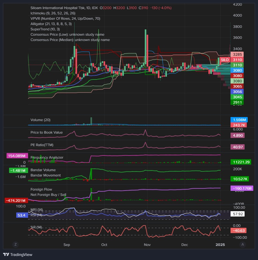
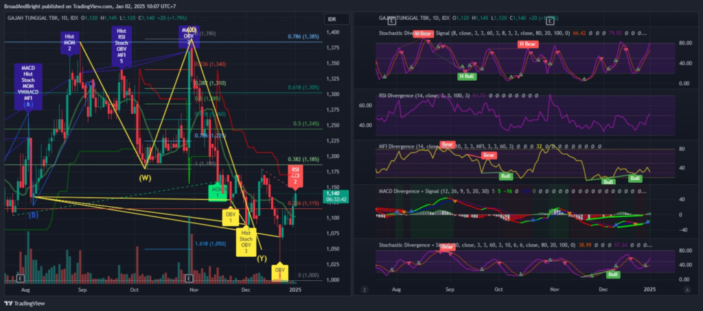
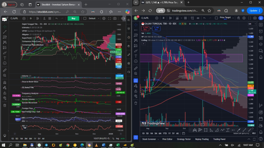
MACD Buy Signal: JSMR PTBA UNVR CMRY CTRA GJTL MPMX MYOR ULTJ, big accum PTBA UNVR SILO, GJTL kita liat juga
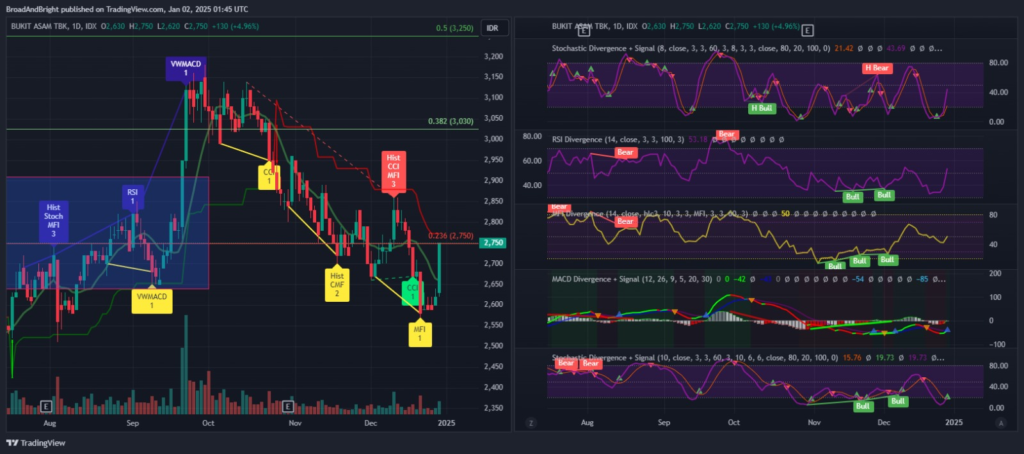
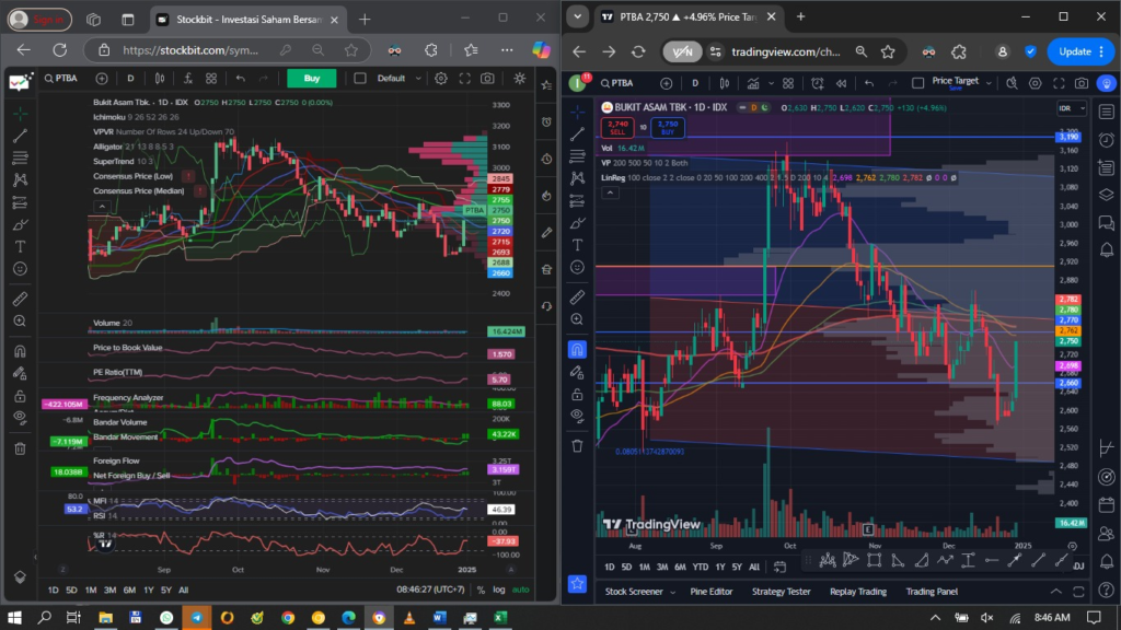
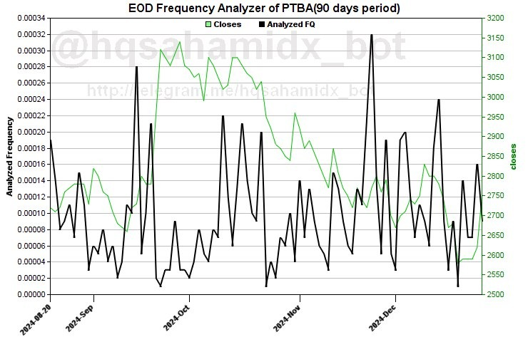
PTBA – abis reg bull div lanjut jalan, loncat kemaren 5% jadi stoch and macd buy, MFI up, w% up, BD FF rev acc, yang kosong portonya kayanya bisa bow di tengah candle kemaren
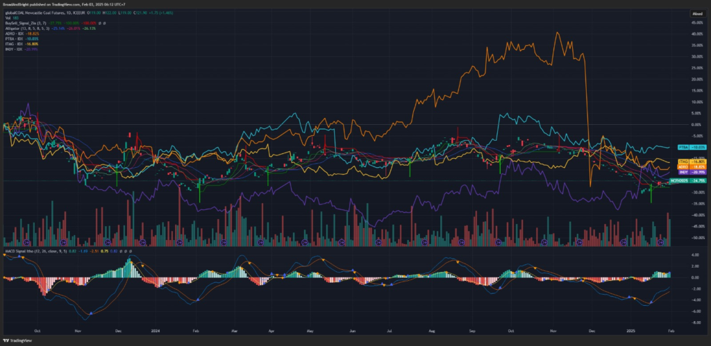
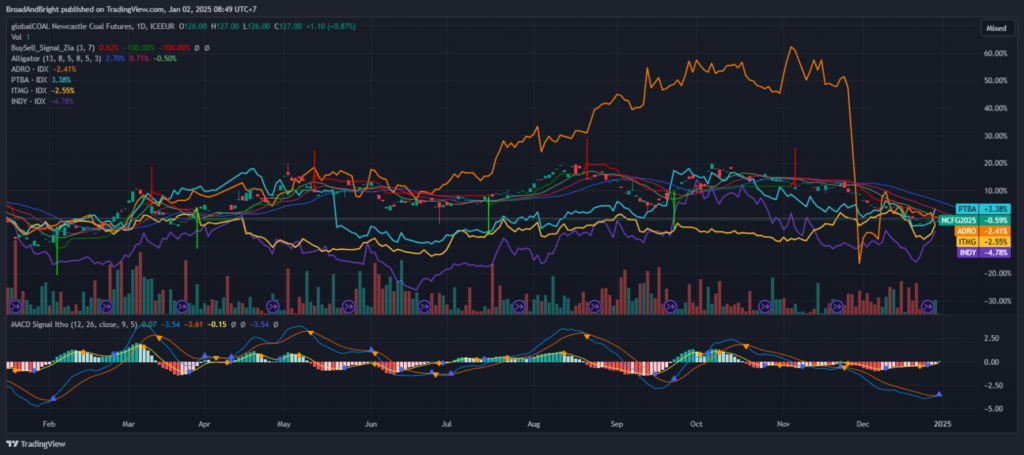
Coal price macd buy signal, menarik ini ADRO INDY ITMG PTBA
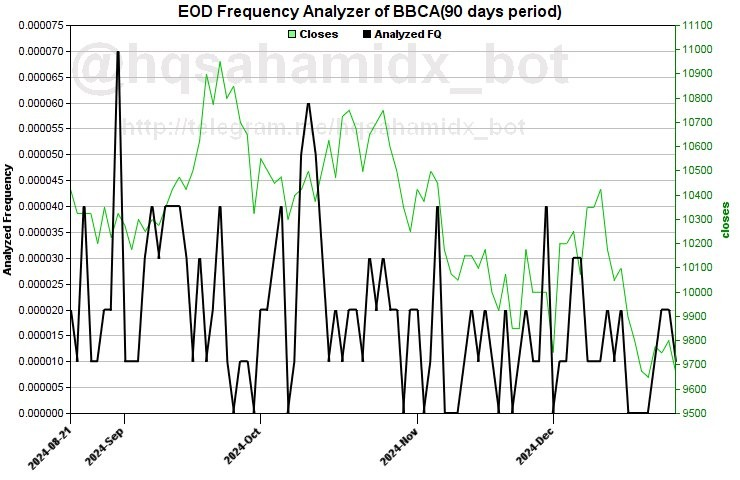
Abis spike jual ada spike kecil
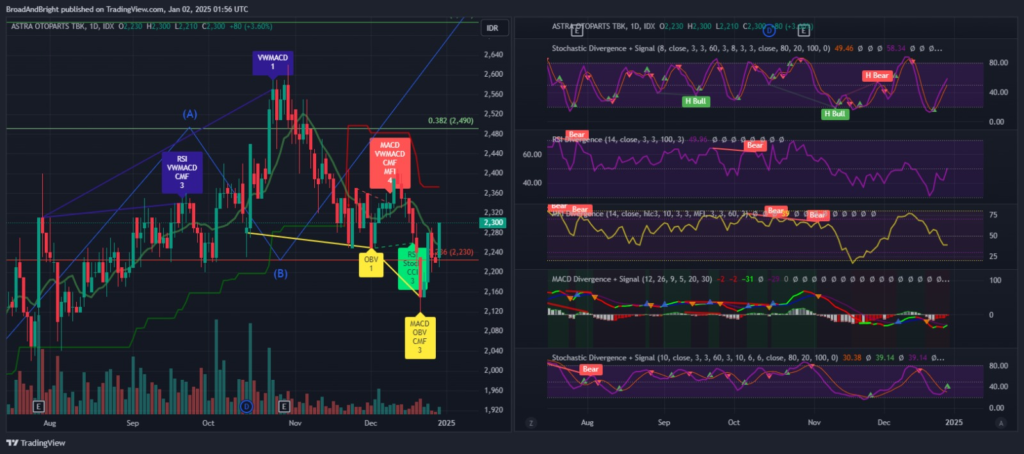
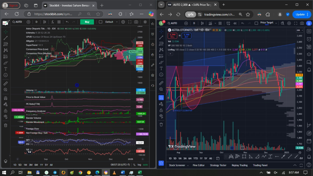
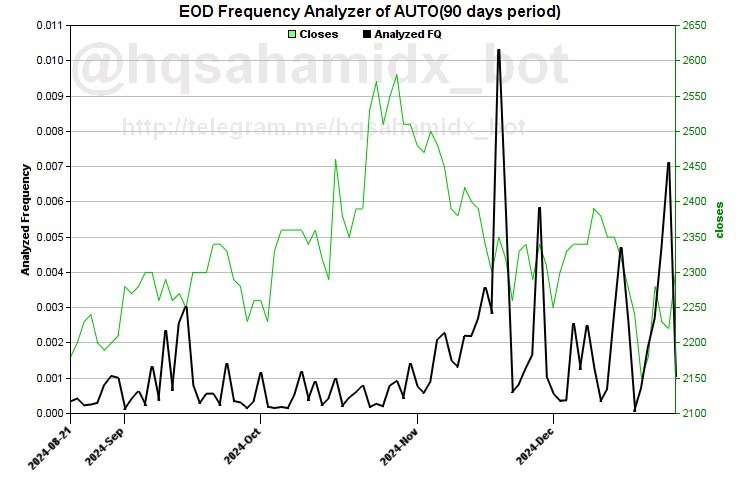
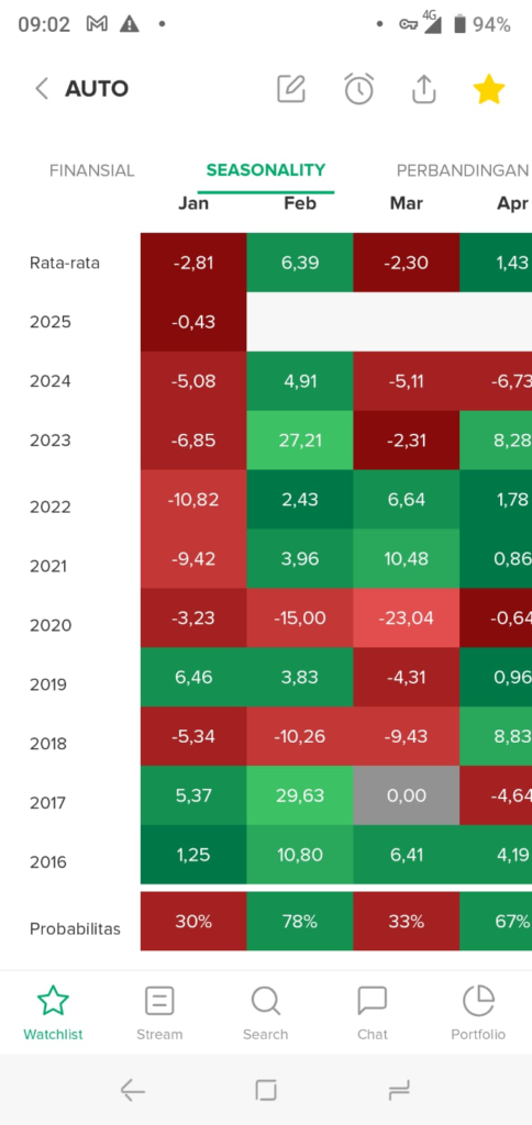
AUTO – valuation ok, stoch buy macd almost buy, MFI still down, w%up, bd acc, FF masih dist, ada spike, kita check dulu
Harusnya sih target 2600 an ya, apalagi kalo liat retracement pattern harusnya bawa ke fibo 61 di 2900 an. Januari group astra suka jalan, kita liat AUTO gimana januari
Kurang ok ternyata… Nanti dulu deh
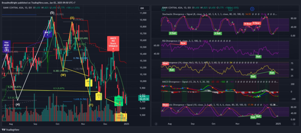
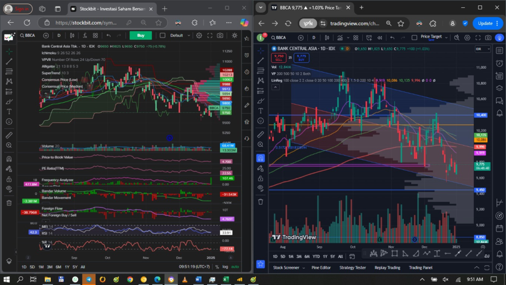
BBCA – stoch buy macd rev up MFI masih down, w%sw, BD FF udah sempet acc,last day rev dist lagi,reg bull div belum cancelled, confirmed by 2 bull candle
no spike… tapi Index sama BBCA seringnya searah, so 2 2 nya udah keliatan mau mantul, bisa spec buy
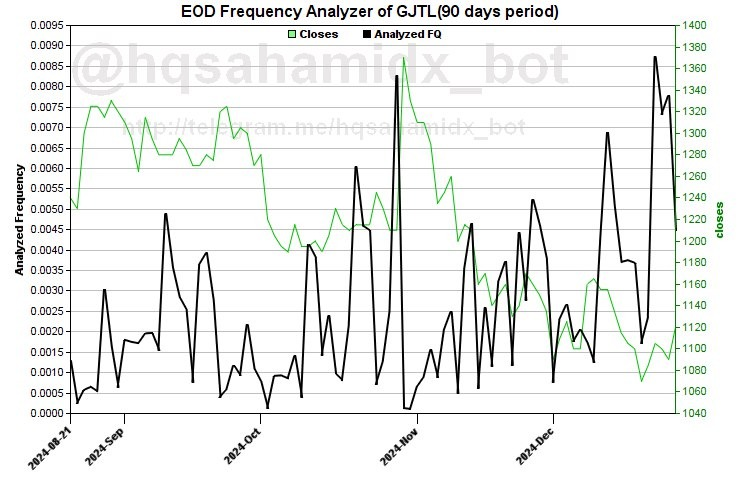
Hajatan ini mah, saham LKH dan ada spike begini, dan bagusnya lagi ini valuation masih rendah ga kaya PTRO yang udah dihajatin sampe 4x lipat. BOW GJTL, idealnya dapet di fibo 23 di 1115
Stocks edge higher amid Mideast caution, Tesla slips after deliveries fall short
US stocks drifted higher on Wednesday as escalating Israel-Iran tensions fanned worries about a wider Middle East conflict, initially prompting caution in the market.
US Europe ijo, asia varied, US bond yield pendek up, yang panjang down, IHSG new record high, beware pullback. Banyak yang sell memanfaatkan hype ATH
USD Index up tipis, metal2 kebanyakan merah kecuali Tin, oil down gas up, coal down CPO up. agak ga asik buat INCO ANTM, semoga ga koreksi jauh, giliran AALI LSIP
IHSG – stoch up, MACD buy, FNB, vol transaksi turun, ketemu reg bear div, semoga lanjut sih, tapi beware kaya kejadian januari, all time high terus longsor
Energy
Stochastic Buy Signal: ADRO BRPT GOTO PGEO SIDO UNTR BNGA ENRG GJTL MPMX, big accum PGEO SIDO GJTL
MACD Buy Signal banyak banget: AMRT ANTM BBRI BRPT GOTO ISATJSMR MDKA PGAS PTBA SIDO SMGR ABMM BTPS MYOR, big accum BBRI ISAT MDKA PTBA SIDO
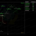
The relative rotation graph (RRG) is a sophisticated tool in technical analysis to help investors decide which sectors, individual stocks, and other assets to pursue. Investors can use it to visually compare the performance and momentum of securities and asset classes against a benchmark. RRGs plot assets on a two-dimensional graph, with the x-axis representing the relative strength ratio and the y-axis for relative strength momentum. This format enables traders and investors to visually assess the relative strength and trendline of different securities, making it valuable for trading, rotation, and asset allocation strategies.
Key Takeaways
The relative rotation graph (RRG) is a chart used in technical analysis to test the performance and momentum of securities or asset classes against a benchmark.
RRGs provide a comprehensive view of the market, helping investors to spot trends, compare multiple securities simultaneously, and make more informed decisions when rebalancing portfolios.
RRGs should be used with other forms of analysis since they are a partial view of the market.
Several tools and resources are available to create and analyze RRGs, ranging from professional-grade software from Bloomberg and Optuma to more accessible platforms like StockCharts.com.
What is the Relative Rotation Graph?
RRGs are used to identify which stocks or sectors are underperforming and outperforming a market index or benchmark. The RRG has four quadrants: leading, weakening, lagging, and improving. Each quadrant is for different stages of an asset’s performance cycle, providing insights into the rotation of market leadership. This movement of securities through the quadrants helps to spotting trends and potential reversals and could provide investors with a strategic advantage in both short-term and long-term trading.
RRGs were created by Julius de Kempenaer in the early 1990s to visualize the relative performance of stocks and other securities against a benchmark and each other. De Kempenaer’s work has been valuable for helping investors make more informed decisions about trading, rotation, and asset allocation.
RRGs are an excellent visual way of analyzing market trends and relative performance. However, like all technical tools, they should be used with other techniques for a more comprehensive approach to trading and investing.
Understanding the Parts of the Relative Rotation Graph
The key elements of RRG and how they indicate relative strength and momentum are as follows:
Axes: The x-axis is the relative strength ratio. This axis measures the performance of a security relative to a benchmark (hence, the strength is “relative”). A value more than 100 indicates outperformance, while a value less than 100 indicates underperformance. The y-axis represents the momentum of the relative strength. This axis shows the rate of change in the relative performance. It is essentially the momentum of the relative strength ratio,
Top right quadrant: The top right quadrant in the RRG is the leading quadrant. Securities in this quadrant are outperforming the benchmark, and their momentum is positive. This indicates strong and improving performance.
Bottom right quadrant: The bottom right quadrant is the weakening quadrant. Here, securities are still outperforming the benchmark, but their momentum is decreasing. Being here suggests that while they are strong, they might be losing their edge.
Bottom left quadrant: This is the lagging quadrant. Securities in this area are underperforming the benchmark with negative momentum. It is a sign of weakness.
Top left quadrant: This is the improving quadrant. This quadrant contains securities that are underperforming the benchmark but show increasing momentum. Being here suggests the potential for a turnaround.
Data points and movement: Each security or asset is represented as a data point on the graph. The position of a data point within the graph indicates its relative strength and momentum. The movement of these data points is tracked over time, usually in a clockwise direction through the quadrants, which illustrates the evolution of their relative performance.
RRGs help investors spot trends and compare several securities at once. However, RRGs should be used with other forms of analysis since they provide a relative, not absolute, view.
How to Interpret Relative Rotation Graphs
Interpreting RRGs involve analyzing the patterns and movements of securities on this chart to identify market leaders, laggards, and potential rotation opportunities.
Movements and Patterns in RRGs
Securities in the RRG generally move clockwise through the four quadrants. This rotation reflects the natural ebb and flow of securities’ relative strength and momentum relative to a benchmark. In addition, the further a security is from the center, the stronger its relative strength or weakness is compared with the benchmark. A security far out in the leading or lagging quadrant has a strong trend, whether positive or negative.
The speed at which a security moves through the quadrants can indicate the stability of its trend. Rapid movements might suggest more volatile or less stable trends. Indeed, many RRGs show tails behind the data points, representing their historical path. Longer tails provide more context on historical performance and trend stability.
Identifying Market Leaders and Laggards
Securities in the leading quadrant are outperforming the benchmark with positive momentum and are considered market leaders. A security with a presence or movement deeper into this quadrant suggests a strong and stable outperformance. Meanwhile, securities in the lagging quadrant are underperforming and have negative momentum. These are the laggards of the market. A security that is continuously in or moving deeper into this quadrant has a strong downtrend relative to the benchmark.
Identifying Rotational Opportunities
A security moving from the improving quadrant into the leading quadrant can be an opportunity. This shift indicates a security is starting to outperform the benchmark with increasing momentum. Similarly, a security moving from the weakening to the lagging quadrant suggests that its previous outperformance is deteriorating, and it is now starting to underperform. This could signal a selling opportunity or a warning to avoid new investments.
Meanwhile, a move from lagging to improving suggests that a security is beginning to reverse its underperformance. This indicates an early stage of recovery, a potential buying opportunity for contrarian investors. Also, securities shifting from leading to weakening are still outperforming but are losing momentum. This could be a signal to take the profits or closely watch the situation to see if it continues losing steam.
Using Relative Rotation Graphs with Other Technical Tools
RRGs can be more effective when put together with other charts in the technical analyst’s toolkit. For example, once an RRG helps determine sectors or stocks that are showing relative strength, you can then review stocks in those sectors in greater depth. Candlestick patterns and volume analysis can give more details on the trading behavior for specific stocks, clueing you in about potential reversals in price trends. Indicators like moving averages, the relative strength index (RSI), and Bollinger Bands can also be used to assess the momentum and volatility of these stocks, helping you decide on entries and exits.
In addition, the RRG’s ability to depict sector rotation can provide great help for those using a top-down investment approach. When showing the sectors moving into the leading quadrant, you might allocate more to sectors poised for growth and reduce your exposure to those going into the lagging quadrant. This sector rotation strategy can be particularly useful during different phases of the economic cycle, as certain sectors tend to do better than others based on the economic conditions. This then points to how fundamental analysis can be used with RRG for a fuller picture of particular sectors and their prospects.
Benefits and Limitations of Relative Rotation Graphs
RRGs offer several advantages and limitations when used in trading, analysis, and portfolio management. Understanding these can help make better use of them for investing.
Benefits and Limitations of Relative Rotation Graphs
Benefits
Easy Visualization of Market Dynamics
Comparison Tool
Helps Identify Trends
Helps with Timely Decision Making
Complements Other Analysis
Helps with Deciding Asset Allocation
Limitations
Shows Relative, Not Absolute Rotation
Lagging Indicator
Requires a Benchmark
Not a Standalone Tool
Provides no Indication of Value
Benefits of Relative Rotation Graphs
Here are some benefits of RRGs:
Visualizing market dynamics: RRGs provide a clear, visual representation of the relative strength and momentum of various securities or sectors, making it easier to understand complex market moves.
Comparison tool: With RRGs, you can compare several securities simultaneously against a benchmark, which can be valuable for portfolio diversification and sector rotation strategies.
Identifying trends: RRGs help pick out leaders, laggards, and emerging trends by observing the movement of securities through different quadrants.
Timely decision-making: The dynamic nature of RRGs aids investors in making timely decisions by highlighting changes in momentum and strength before they become evident through price movements alone.
Complementing other analyses: RRGs can be used alongside other technical, fundamental, and quantitative analysis tools, providing a more holistic view of the market.
Sector and asset allocation: RRGs are particularly useful for sector analysis and distributing assets since they help identify industries or asset classes likely to outperform or underperform.
Limitations of Relative Rotation Graphs
Here are some limitations of RRGs:
Relative, not absolute, rotation: RRGs illustrate the performance relative to a benchmark, not the absolute performance. A security in the leading quadrant could still be losing value in a bear market.
Lagging indicator: RRGs inherently lag. They reflect past performance and trends, which may not always predict future movements.
Requires a benchmark: The effectiveness of RRGs depends on the choice of an appropriate benchmark, which can vary based on the assets.
Not a stand-alone tool: RRGs should not to be used in isolation. They do not deliver insights into company fundamentals, macroeconomic conditions, or market sentiment.
No indication of value: RRGs do not provide information about the value of securities. A stock might be moving into the leading quadrant but still be overpriced.
While RRGs are powerful for visualizing and analyzing market trends and relative performance, they are most effective when used as part of a broader, diversified approach to investment analysis and decision-making. Understanding their limitations is crucial to avoid overestimating their relevance.
Differences Between the Relative Rotation Graph and the Relative Strength Index
The Relative Rotation Graph vs. the Relative Strength Index
Relative Rotation Graph (RRG)
Scope: RRG is used to compare several securities against a benchmark.
Dimensions: RRG provides a two-dimensional view.
Interpretation: RRG is better for relative performance and identifying trends.
Usage: RRG is typically used for asset allocation and sector rotation.
Relative Strength Index (RSI)
Scope: The RSI is used for analyzing the price momentum of a single security.
Dimensions: The RSI is a one-dimensional oscillator.
Interpretation: The RSI illustrates momentum and potential price reversals.
Usage: RSI is commonly used to identify potential entries and exits.
The RRG and the relative strength index (RSI) are both used in technical analysis, but serve different purposes and provide different kinds of information. RRGs are used for comparing several securities against a benchmark, while the RSI is for analyzing the price momentum of a single security. In addition, RRGs offer a two-dimensional view (strength and momentum), while the RSI is a one-dimensional oscillator (it constructs high and low bands and provides a trend indicator).
RRG is best used for relative performance and identifying trends. Meanwhile, the RSI is best for ascertaining momentum and potential price reversals. Another set of differences is that RRG is often used for asset allocation and sector rotation, while the RSI commonly helps identify potential entries and exits.
As such, RRG is more for visualizing and comparing the relative strength and trends of multiple securities, and the RSI sets out the momentum of individual securities and can help identify when there are overbought or oversold conditions.
Resources for Creating Relative Rotation Graphs
Making your RRGs requires specialized tools and resources, as these graphs involve complex calculations and dynamic visuals. Here are some great tools to use:
RRG Research: Founded by Julius de Kempenaer, the creator of RRGs, the firm’s site provides tools and insights related to RRGs. The website offers educational resources, analysis, and access to RRGs.
Bloomberg Professional Services Software: The Bloomberg Professional Services software, a leading financial data and analytics platform, offers RRG charts as part of its services. It provides functions for creating and customizing RRGs, making it a popular choice among professional investors and analysts.
Refinitiv Eikon: This platform is another leading financial data and analytics provider that offers RRG charts as part of its services.
StockCharts.com: This online platform offers various chart tools, including RRGs. It has a user-friendly interface for creating RRGs, suitable for professionals and individual investors.
Optuma: Optuma is a professional-level technical analysis software that includes RRGs among its features. Known for its advanced analysis tools, Optuma caters to professional traders and analysts.
The tool you choose depends on your needs, skill level, and access to resources.
Which Technical Analysis Indicators Work Well with Relative Rotation Graphs?
Combining RRGs with other indicators can provide a more comprehensive view of the market and help refine investment strategies. Some indicators include moving averages, the RSI, the moving average convergence divergence, Bollinger Bands, support and resistance levels, and other chart patterns.
What Asset Groups Work Well with Relative Rotation Graphs?
RRGs are best used to analyze asset groups when relative performance is key. These can include equity sectors and industries, exchange-traded funds, indexes, benchmarks, fixed-income securities, commodities, and currencies. RRGs’ ability to compare several assets simultaneously makes them invaluable for a wide range of investment strategies from picking individual stocks to deciding on broad asset allocations. However, with all financial and investment tools, they should be used as part of a broader, diversified approach to market analysis and not relied upon in isolation.
Which Benchmarks Work Well with Relative Rotation Graphs?
The benchmark chosen is critical in interpreting RRGs, setting the standard against which the other securities or asset classes are measured. The benchmark to use depends on the type of assets being analyzed and the specific goals of the analysis. Some commonly used benchmarks include broad market, sector, fixed-income, commodity, regional, country-specific, currency, real estate, and thematic indexes.
How Can the Reliability of Relative Rotation Graphs Be Improved?
Increasing the reliability of RRGs involves choosing the right benchmarks, using quality data, understanding the tool’s limitations, and integrating it with other forms of analysis. Regular reviews, adaptation to changing market conditions, and ongoing education are essential for effectively using RRGs in trading and investments.
The Bottom Line
RRGs are vital for some types of technical analysis, offering a way to visualize the relative performance and momentum of different securities against a chosen benchmark. Its design, characterized by placing securities in four distinct quadrants—labeled leading, weakening, lagging, and improving—allows traders and investors to quickly grasp shifts in the market and identify assets gaining or losing strength against others. This makes RRGs particularly useful for strategies involving sector rotation, asset allocation, and portfolio diversification.
For traders, RRGs provide a strategic edge by enabling a clear understanding of various market segments’ relative trends and strengths. By integrating RRG analysis with other technical indicators and fundamental insights, traders can identify potential entry and exit points more effectively.