A bullish engulfing pattern is a white candlestick that closes higher than the previous day’s opening after opening lower than the previous day’s close. It can be identified when a small black candlestick, showing a bearish trend, is followed the next day by a large white candlestick, showing a bullish trend, the body of which completely overlaps or engulfs the body of the previous day’s candlestick.
A bullish engulfing pattern is a candlestick pattern that forms when a small black candlestick is followed the next day by a large white candlestick, the body of which completely overlaps or engulfs the body of the previous day’s candlestick.
Bullish engulfing patterns are more likely to signal reversals when they are preceded by four or more black candlesticks.
Investors should look not only to the two candlesticks which form the bullish engulfing pattern but also to the preceding candlesticks.
Understanding a Bullish Engulfing Pattern
The bullish engulfing pattern is a two-candle reversal pattern. The second candle completely ‘engulfs’ the real body of the first one, without regard to the length of the tail shadows.
This pattern appears in a downtrend and is a combination of one dark candle followed by a larger hollow candle. On the second day of the pattern, the price opens lower than the previous low, yet buying pressure pushes the price up to a higher level than the previous high, culminating in an obvious win for the buyers.
It is advisable to enter a long position when the price moves higher than the high of the second engulfing candle—in other words when the downtrend reversal is confirmed.
What Does a Bullish Engulfing Pattern Tell You?
A bullish engulfing pattern is not to be interpreted as simply a white candlestick, representing upward price movement, following a black candlestick, representing downward price movement. For a bullish engulfing pattern to form, the stock must open at a lower price on Day 2 than it closed at on Day 1. If the price did not gap down, the body of the white candlestick would not have a chance to engulf the body of the previous day’s black candlestick.
Because the stock both opens lower than it closed on Day 1 and closes higher than it opened on Day 1, the white candlestick in a bullish engulfing pattern represents a day in which bears controlled the price of the stock in the morning only to have bulls decisively take over by the end of the day.
The white candlestick of a bullish engulfing pattern typically has a small upper wick, if any. That means the stock closed at or near its highest price, suggesting that the day ended while the price was still surging upward.
This lack of an upper wick makes it more likely that the next day will produce another white candlestick that will close higher than the bullish engulfing pattern closed, though it’s also possible that the next day will produce a black candlestick after gapping up at the opening. Because bullish engulfing patterns tend to signify trend reversals, analysts pay particular attention to them.
Bullish Engulfing Pattern vs. Bearish Engulfing Pattern
These two patterns are opposites of one another. A bearish engulfing pattern occurs after a price moves higher and indicates lower prices to come. Here, the first candle, in the two-candle pattern, is an up candle. The second candle is a larger down candle, with a real body that fully engulfs the smaller up candle.
Example of a Bullish Engulfing Pattern
As a historical example, let’s consider Philip Morris (PM) stock. The company’s shares were a great long in 2011 and remained in an uptrend. In 2012, though, the stock was retreating.
On January 13, 2012, a bullish engulfing pattern occurred; the price jumped from an open of $76.22 to close out the day at $77.32. This bullish day dwarfed the prior day’s intraday range where the stock finished down marginally. The move showed that the bulls were still alive and another wave in the uptrend could occur.
Bullish Engulfing Pattern Example.
Bullish Engulfing Candle Reversals
Investors should look not only to the two candlesticks which form the bullish engulfing pattern but also to the preceding candlesticks. This larger context will give a clearer picture of whether the bullish engulfing pattern marks a true trend reversal.
Bullish engulfing patterns are more likely to signal reversals when they are preceded by four or more black candlesticks. The more preceding black candlesticks the bullish engulfing candle engulfs, the greater the chance a trend reversal is forming, confirmed by a second white candlestick closing higher than the bullish engulfing candle.
Acting on a Bullish Engulfing Pattern
Ultimately, traders want to know whether a bullish engulfing pattern represents a change of sentiment, which means it may be a good time to buy. If volume increases along with price, aggressive traders may choose to buy near the end of the day of the bullish engulfing candle, anticipating continuing upward movement the following day. More conservative traders may wait until the following day, trading potential gains for greater certainty that a trend reversal has begun.
Limitations of Using Engulfing Patterns
A bullish engulfing pattern can be a powerful signal, especially when combined with the current trend; however, they are not bullet-proof. Engulfing patterns are most useful following a clean downward price move as the pattern clearly shows the shift in momentum to the upside. If the price action is choppy, even if the price is rising overall, the significance of the engulfing pattern is diminished since it is a fairly common signal.
The engulfing or second candle may also be huge. This can leave a trader with a very large stop loss if they opt to trade the pattern. The potential reward from the trade may not justify the risk.
Establishing the potential reward can also be difficult with engulfing patterns, as candlesticks don’t provide a price target. Instead, traders will need to use other methods, such as indicators or trend analysis, for selecting a price target or determining when to get out of a profitable trade.
The average true range (ATR) is a technical analysis indicator introduced by market technician J. Welles Wilder Jr. in his book New Concepts in Technical Trading Systems that measures market volatility by decomposing the entire range of an asset price for that period.
The true range indicator is taken as the greatest of the following: current high less the current low; the absolute value of the current high less the previous close; and the absolute value of the current low less the previous close. The ATR is then a moving average, generally using 14 days, of the true ranges.
Traders can use shorter periods than 14 days to generate more trading signals, while longer periods have a higher probability to generate fewer trading signals.
Key Takeaways
The average true range (ATR) is a market volatility indicator used in technical analysis.
It is typically derived from the 14-day simple moving average of a series of true range indicators.
The ATR was initially developed for use in commodities markets but has since been applied to all types of securities.
ATR shows investors the average range prices swing for an investment over a specified period.
The Average True Range (ATR) Formula
The formula to calculate ATR for an investment with a previous ATR calculation is :
nPrevious ATR(n−1)+TRwhere:n=Number of periodsTR=True range
If there is not a previous ATR calculated, you must use:
(n1)i∑nTRiwhere:TRi=Particular true range, such as first day’s TR,then second, then thirdn=Number of periods
The capital sigma symbol (Σ) represents the summation of all of the terms for n periods starting at i, or the period specified. If there is no number following i, it is assumed the starting point is the first period (you may see i=1, noting to start summing at the first term).
You must first use the following formula to calculate the true range:
TR = Max [(H−L),∣H−Cp∣,∣L−Cp∣]where:H=Today’s highL=Today’s lowCp=Yesterday’s closing priceMax=Highest value of the three termsso that:(H−L)=Today’s high minus the low∣H−Cp∣=Absolute value of today’s high minusyesterday’s closing price∣L−Cp∣=Absolute value of today’s low minusyesterday’s closing price
How to Calculate the ATR
The first step in calculating ATR is to find a series of true range values for a security. The price range of an asset for a given trading day is its high minus its low. To find an asset’s true range value, you first determine the three terms from the formula.
Suppose that XYZ’s stock had a trading high today of $21.95 and a low of $20.22. It closed yesterday at $21.51. Using the three terms, we use the highest result:
(H−L)=$21.95−$20.22=$1.73
∣(H−Cp)∣=∣$21.95−$21.51∣=$0.44
∣(L−Cp)∣=∣$20.22−$21.51∣=$1.29
The number you’d use would be $1.73 because it is the highest value.
Because you don’t have a previous ATR, you need to use the ATR formula:
(n1)i∑nTRi
Using 14 days as the number of periods, you’d calculate the TR for each of the 14 days. Assume the following prices from the table.
Daily Values
High
Low
Yesterday’s Close
Day 1
$ 21.95
$ 20.22
$ 21.51
Day 2
$ 22.25
$ 21.10
$ 21.61
Day 3
$ 21.50
$ 20.34
$ 20.83
Day 4
$ 23.25
$ 22.13
$ 22.65
Day 5
$ 23.03
$ 21.87
$ 22.41
Day 6
$ 23.34
$ 22.18
$ 22.67
Day 7
$ 23.66
$ 22.57
$ 23.05
Day 8
$ 23.97
$ 22.80
$ 23.31
Day 9
$ 24.29
$ 23.15
$ 23.68
Day 10
$ 24.60
$ 23.45
$ 23.97
Day 11
$ 24.92
$ 23.76
$ 24.31
Day 12
$ 25.23
$ 24.09
$ 24.60
Day 13
$ 25.55
$ 24.39
$ 24.89
Day 14
$ 25.86
$ 24.69
$ 25.20
You’d use these prices to calculate the TR for each day.
Trading Range
H-L
H-Cp
L-Cp
Day 1
$ 1.73
$ 0.44
$ (1.29)
Day 2
$ 1.15
$ 0.64
$ (0.51)
Day 3
$ 1.16
$ 0.67
$ (0.49)
Day 4
$ 1.12
$ 0.60
$ (0.52)
Day 5
$ 1.15
$ 0.61
$ (0.54)
Day 6
$ 1.16
$ 0.67
$ (0.49)
Day 7
$ 1.09
$ 0.61
$ (0.48)
Day 8
$ 1.17
$ 0.66
$ (0.51)
Day 9
$ 1.14
$ 0.61
$ (0.53)
Day 10
$ 1.15
$ 0.63
$ (0.52)
Day 11
$ 1.16
$ 0.61
$ (0.55)
Day 12
$ 1.14
$ 0.63
$ (0.51)
Day 13
$ 1.16
$ 0.66
$ (0.50)
Day 14
$ 1.17
$ 0.66
$ (0.51)
You find that the highest values for each day are from the (H – L) column, so you’d add up all of the results from the (H – L) column and multiply the result by 1/n, per the formula.
So, the average volatility for this asset is $1.18.
Now that you have the ATR for the previous period, you can use it to determine the ATR for the current period using the following:
nPrevious ATR(n−1)+TR
This formula is much simpler because you only need to calculate the TR for one day. Assuming on Day 15, the asset has a high of $25.55, a low of $24.37, and closed the previous day at $24.87; its TR works out to $1.18:
14$1.18(14−1)+$1.18
14$1.18(13)+$1.18
14$15.34+$1.18
14$16.52=$1.18
The stock closed the day again with an average volatility (ATR) of $1.18.
Wilder originally developed the ATR for commodities, although the indicator can also be used for stocks and indices. Simply put, a stock experiencing a high level of volatility has a higher ATR, and a lower ATR indicates lower volatility for the period evaluated.
The ATR may be used by market technicians to enter and exit trades and is a useful tool to add to a trading system. It was created to allow traders to more accurately measure the daily volatility of an asset by using simple calculations. The indicator does not indicate the price direction; instead, it is used primarily to measure volatility caused by gaps and limit up or down moves. The ATR is relatively simple to calculate, and only needs historical price data.
The ATR is commonly used as an exit method that can be applied no matter how the entry decision is made. One popular technique is known as the “chandelier exit” and was developed by Chuck LeBeau. The chandelier exit places a trailing stop under the highest high the stock has reached since you entered the trade. The distance between the highest high and the stop level is defined as some multiple multiplied by the ATR.
The ATR can also give a trader an indication of what size trade to use in the derivatives markets. It is possible to use the ATR approach to position sizing that accounts for an individual trader’s willingness to accept risk and the volatility of the underlying market.
Example of How to Use the ATR
As a hypothetical example, assume the first value of a five-day ATR is calculated at 1.41, and the sixth day has a true range of 1.09. The sequential ATR value could be estimated by multiplying the previous value of the ATR by the number of days less one and then adding the true range for the current period to the product.
Next, divide the sum by the selected timeframe. For example, the second value of the ATR is estimated to be 1.35, or (1.41 * (5 – 1) + (1.09)) / 5. The formula could then be repeated over the entire period.
While the ATR doesn’t tell us in which direction the breakout will occur, it can be added to the closing price, and the trader can buy whenever the next day’s price trades above that value. This idea is shown below. Trading signals occur relatively infrequently but usually indicate significant breakout points. The logic behind these signals is that whenever a price closes more than an ATR above the most recent close, a change in volatility has occurred.
There are two main limitations to using the ATR indicator. The first is that ATR is a subjective measure, meaning that it is open to interpretation. No single ATR value will tell you with any certainty that a trend is about to reverse or not. Instead, ATR readings should always be compared against earlier readings to get a feel of a trend’s strength or weakness.
Second, ATR only measures volatility and not the direction of an asset’s price. This can sometimes result in mixed signals, particularly when markets are experiencing pivots or when trends are at turning points. For instance, a sudden increase in the ATR following a large move counter to the prevailing trend may lead some traders to think the ATR is confirming the old trend; however, this may not be the case.
How Do You Use ATR Indicator in Trading?
Average true range is used to evaluate an investment’s price volatility. It is used in conjunction with other indicators and tools to enter and exit trades or decide whether to purchase an asset.
How Do You Read ATR Values?
An average true range value is the average price range of an investment over a period. So if the ATR for an asset is $1.18, its price has an average range of movement of $1.18 per trading day.
What Is a Good Average True Range?
A good ATR depends on the asset. If it generally has an ATR of close to $1.18, it is performing in a way that can be interpreted as normal. If the same asset suddenly has an ATR of more than $1.18, it might indicate that further investigation is required. Likewise, if it has a much lower ATR, you should determine why it is happening before taking action.
The Bottom Line
The average true range is an indicator of the price volatility of an asset. It is best used to determine how much an investment’s price has been moving in the period being evaluated rather than an indication of a trend. Calculating an investment’s ATR is relatively straightforward, only requiring you to use price data for the period you’re investigating.
The 50-day moving average marks a line in the sand for traders holding positions through inevitable drawdowns. The strategy we employ when price nears this inflection point often decides whether we walk away with a well-earned profit or a frustrating loss. Considering the consequences, it makes sense to improve our understanding about this price level, as well as finding new ways to manage risk when it comes into play.
The most common formula takes the last 50 price bars and divides by the total. This yields the 50-day simple moving average (SMA) used by technicians for many decades. The calculation has been tweaked in many ways over the years as market players try to build a better mousetrap. The 50-day exponential moving average (EMA) offers the most popular variation, responding to price movement more quickly than its simple minded cousin. This extra speed in signal production defines a clear advantage over the slower version, making it a superior choice.
The 50-day EMA gives technicians a seat at the 50-yard line, the perfect location to watch the entire playing field for mid-term opportunities and natural counterswings after active trends, higher or lower. It’s also neutral ground when price action is often misinterpreted by the majority. And as our contrary market proves over and over again, the most reliable signals tend to erupt when the majority is sitting on the wrong side of the action.
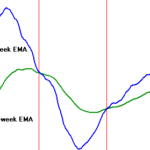
There are dozens of ways to use the 50-day EMA in market strategies. It works as a reality check when a position hits the magic line after a rally or selloff. It has equal benefit in lower and higher time frames, applying the indicator to intraday charts or tracking long term trends with the 50-week or 50-month version. Or play a game of pinball, trading oscillations between the 50-day EMA and longer term 200-day EMA. It even works in the arcane world of market voodoo, with 50/200 day crossovers signaling bullish golden crosses or bearish death crosses.
Pullbacks
The 50-day EMA most often comes into play when you’re positioned in a trend that turns against you in a natural counterswing, or in reaction to an impulse that’s dragging thousands of financial instruments along for the ride. It makes sense to place a stop just across the moving average because it represents intermediate support (resistance in a downtrend) that should hold under normal tape conditions. The problem with this reasoning is it doesn’t work as intended in our volatile modern markets.
The 50 and 200-day EMAs have morphed from narrow lines into broad zones in the last two decades due to aggressive stop hunting. You need to consider how deep these violations will go before placing a stop or timing an entry at or near the moving average. Patience is key in these circumstances because testing at the 50-day EMA usually resolves within three to four price bars. The trick is to stay out of the way until a) the reversal kicks in or b) the level breaks, yielding a price thrust against your position.
The risk of getting it wrong will hurt your wallet, so how long should you stick around when price tests the 50-day EMA? While there’s no perfect way to avoid whipsaws, examining other technicals often pinpoints the exact extension of a reversal. For example, Intel (INTC) returned to the January high in April and sold off to the 50-day EMA. It broke support, dropped to the .386 Fibonacci rally retracement and bounced back to the moving average in the next session. The stock regained support on the third day and entered a recovery, completing a cup and handle breakout pattern.
50-Day Fractals
The moving average works just as well in lower and higher time frames. As a result, day traders will find benefit in placing 50-bar EMAs on 15 and 60 minute charts because they define natural end points for intraday oscillations. Just keep in mind that noise increases as time frame decreases, lowering its value on 5 and 1 minute charts. On the flip side, the indicator shows excellent reliability on weekly and monthly charts, often pinpointing exact turning points in corrections and long term trends.
This makes sense when considering that the 50-week EMA defines mean reversion over an entire year while the 50-month EMA tracks more than four years of market activity, approaching the average length of a typical business cycle. Market timers can use these long-term moving averages to establish profitable positions lasting for months or years while violations offer perfect levels to take profits and reallocate capital into other long term instruments.
Apple (AAPL) set up excellent buying opportunities at the 50-month EMA in 2009 and 2013. It broke moving average support in September 2008 and spent 5 months grinding sideways before remounting that level in April 2009, issuing a “failure of a failure” buy signal that yielded more than 80 points over three years. It tested the moving average a second time in 2013, spending four months building a double bottom that triggered a 100 percent rally into 2014. Note how the lows matched support perfectly, offering an incredible low risk entry for patient market players.
50-200 Day Pinball
Fast trends in both directions tend to increase the separation between the 50 and 200-day EMAs. Once a countertrend breaks one of these averages, it often carries into the other average, setting up a few rounds of the 50-200 “pinball” strategy. Swing traders are natural beneficiaries of this two-sided technique, going long and then short until one side of the box gives way to a more active trend impulse.
Biogen (BIIB) hit a new high in March after a long uptrend and entered a steep correction that broke the 50-day EMA a few days later. Price action then entered a two month game of 50-200 pinball, traversing more than 75 points between new resistance at the 50-day EMA and long term support at the 200-day EMA. Swing reversals took place close to target numbers, allowing easy entry and relatively tight stops for a triple digit stock.
Bullish and Bearish Crossovers
The downward crossover of the 50-day EMA through the 200-day EMA signals a death cross that many technicians believe marks the end of an uptrend. An upward crossover or golden cross is alleged to possess similar magic properties in establishing a new uptrend. In reality, numerous crisscrosses can print in the life cycle of an uptrend or downtrend and these classic signals show little reliability.
It’s a different story with the 50 and 200-week EMAs. SPDR S&P Trust (SPY) shows four valid cross signals going back 15 years, two in each direction. More importantly, there were no false signals during this time, which included three bull markets and two bear markets. Looking at historic Dow Industrial data, the last invalid cross occurred more than 30 years ago, in 1982. This tells us that golden and death crosses deserve a respected place in market analysis.
The Bottom Line
The 50-day EMA identifies a natural mean reversion level for the intermediate time frame. It has numerous applications in price prediction, position choice and strategy building. Traders, market timers and investors all benefit from 50-day EMA study, making it an indispensable ingredient in your technical market analysis.